Tableau Visualization
Tableau is arguably the biggest deal now in terms of data visualization for non-programmers. Let's pretend you are not a programer. Learn and experience what it is like to make visualizations using Tableau to answer the same questions about your classmates in our course.
For each of the question, think about what chart you should use to convey your answer and make your best effort to create something that makes sense to you. There's no right or wrong. When we meet in the class again, we will set aside time for each team to discuss and compare the variety of visualization solutions each member has come up with for the same set of questions. It will be fun!
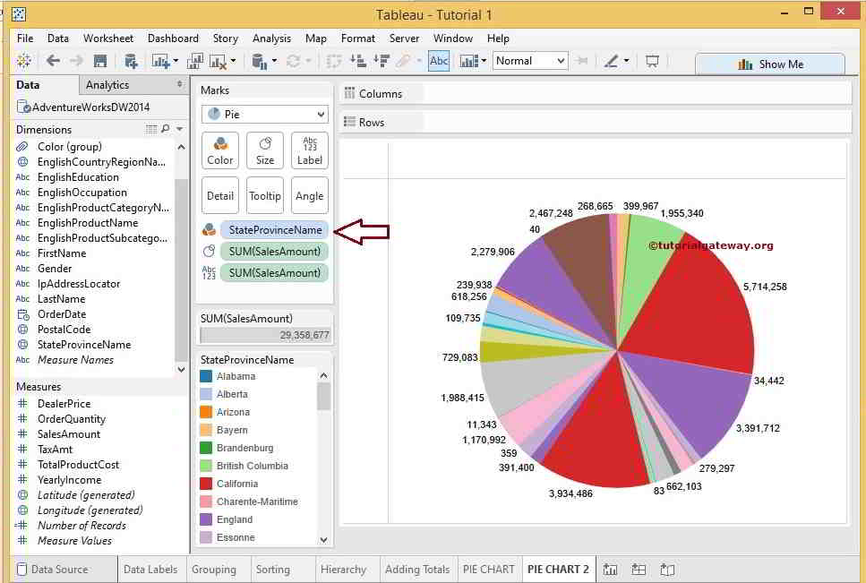
To include a Tableau visualization in your report, take a screenshot, save it as an image,
put it in the learning/week2 folder, and replace  with
your own image. Please makes sure your screenshot includes the entire Tableau interface
including the controls, widgets ...etc.
How big the deal Tableau really is?
(write your answer based on the statistics you can find online)
What is the GDP of countries per Capita
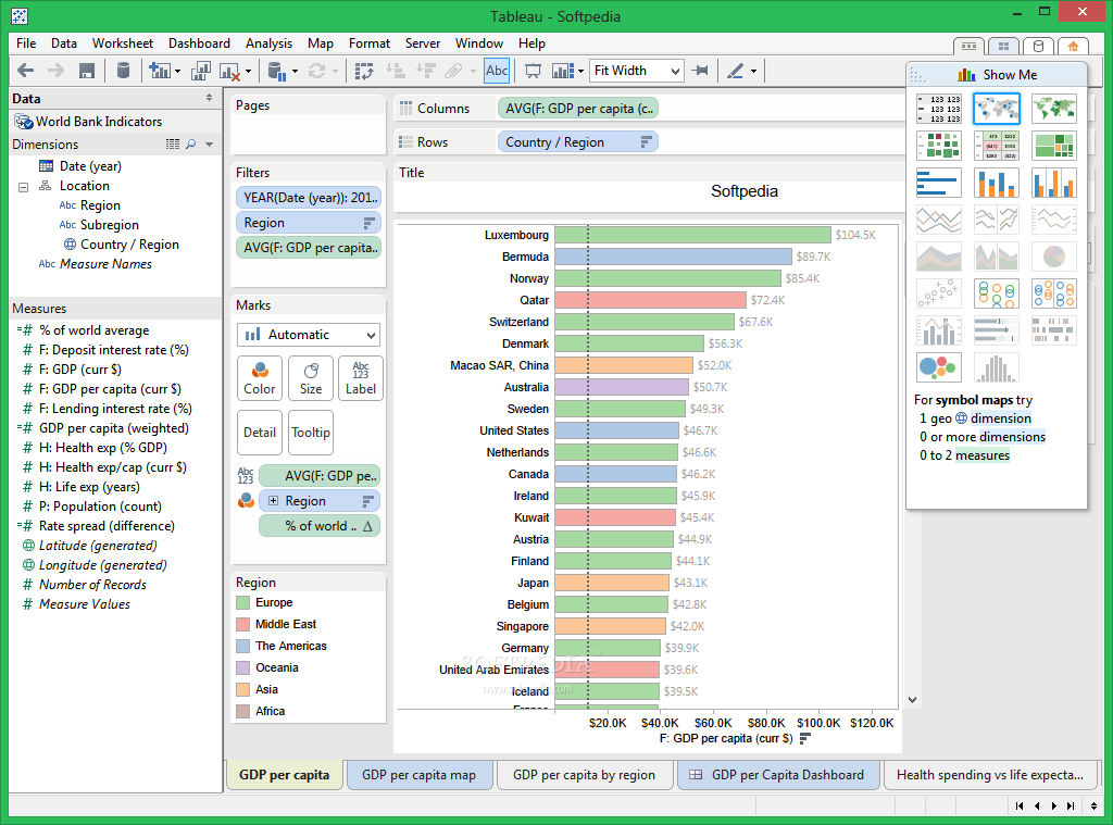
A bar chart is perfect for displaying data sets that closely resemble each other. Using a GDP per capita as the x-axis and using the country name as the y-axis makes this chart easily readable. Also adding the total to the end of the bar chart increases readability and makes the reader have to guess less about the real value of the number.
How does the growth of the top 100 tech companies compare?
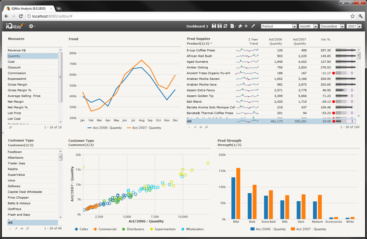
Using a line chart, showing growth is easy. This will allow you to show how the growth of a company has either increased or declined over a period of time based on their revenue. The lines are distinguishable by color, and provide a good look at if the company is trending toward more or less revenue.
What states use the most electricity?
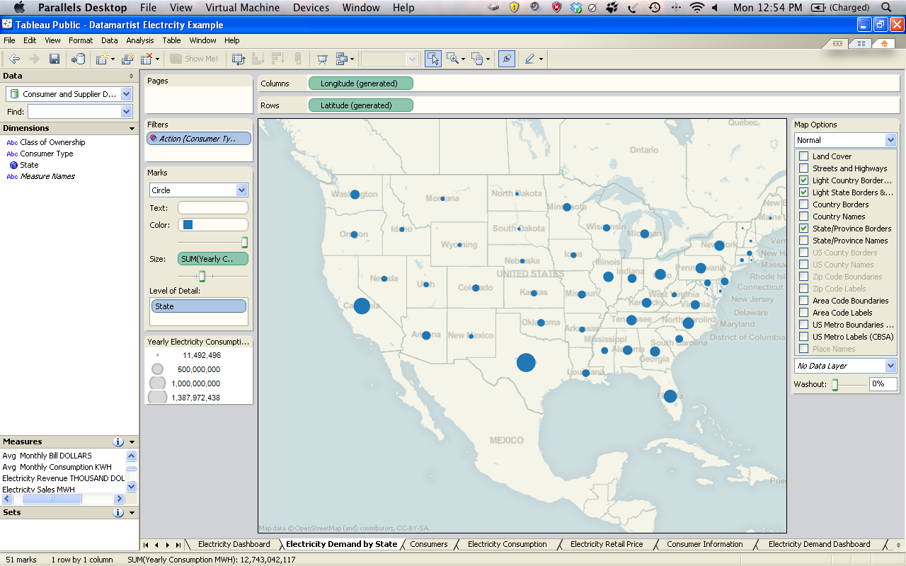
Using the map overlay gives the reader an immediate look at our data set. We can see it has to deal with the states of the United States without even fully reading the data, this is good. Since we know all states have electricity there is no need to try to differentiate between them. So using the same symbol is advised, the only thing to show how much electricity is being used would be to make a legend and color coordinate them or just use different sized symbols to denote larger power usages.
What is the percentage of goods I am selling?
For a seller, they have 100% product, they sell this product to consumers. Since we are using values that deal with percrentages, a pie chart is great for showing this off. A pie chart will show you a sub group of a group. Each pie piece is a sub group, often labeled by name or color, that shows what percentage of the whole it is taking up. So if I sold gum, soda, and chips, and I saw that 75% of my sales are chips, I might want to step up the ammount of chips I buy to sell, or update the selection of chips to increase profits. Or I might cut back on chip sales if I am a soda store.