Visualization
Using Tableau, create visualization for each question in the report. You will work on this independently just like last week.
To include a Tableau visualization in your report, take a screenshot, save it as an image,
put it in the learning/week2 folder, and replace  with
your own image. Please makes sure your screenshot includes the entire Tableau interface
including the controls, widgets ...etc.
Import
Data: fcq.clean.json
(a copy of this file is in your book repository already in the directory hackathons/fcq)
This dataset is provided to you in the JSON format. Your first task is to figure out how to transform this JSON file into a format that can be fed into Tableau. As a junior and senior, you are expected to be able to look around the Internet to problem solve.
How many courses in IPHY that have 4 credit hours? by Fadhil
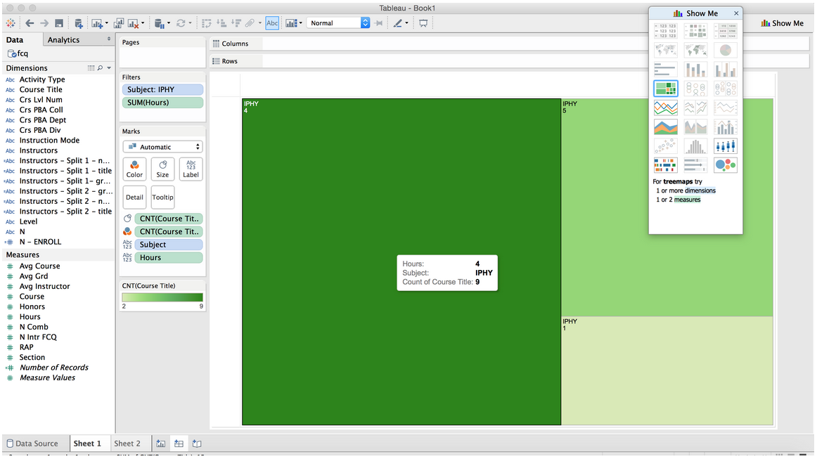
I filtered the courses to get IPHY, then I counted the ammount of courses per credit hour. There are 9 courses that are 4 credit hour classes. I chose the box chart, because it shows the other classes and their totals as well.
Which departments offer the most 4000 level classes? by Brian
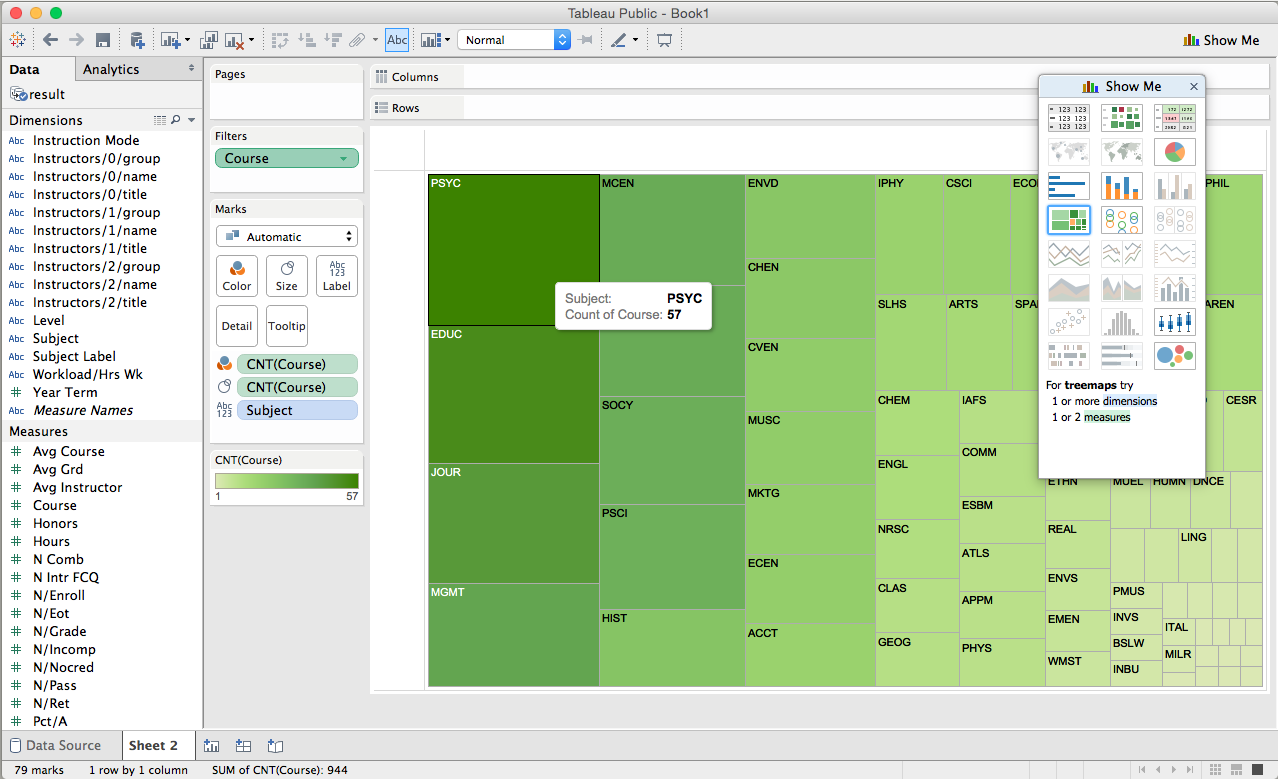
I just filtered for classes between 4,000 and 4,999 then grouped them by subject. A box chart shows the most information. PSYC has 57 classes.
Which department has the highest enrollment by Tristan
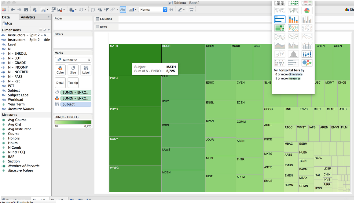
I took the max enrollment, and grouped them by subject. Math has 8,725 students enrolled in their classes. The box chart shows the most information again.
What instructor's course has the highest enrollment? by Zhilli
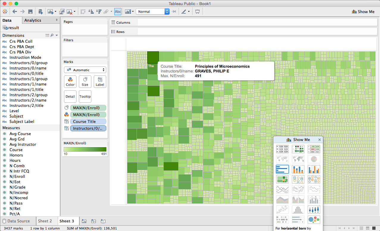
Here I took the max enrollment and grouped by course title. Then I added the label for instructor name to see who had the most enrolled in their class. It is Philip E Graves, the class is Principles of Microeconomics, and the enrollment is 491.
What instructor has the highest rating? by Andrew
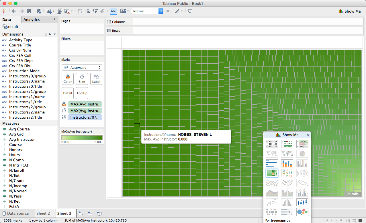
I sorted by max Avg Instructor Rating, then I added a label for instructor name. There were many 6 rating instructors, but when I did this with lodash Steven L Hobbs was the first name returned. So even though he is tied for first with other instructors, technically he is first and I found him on the data sheet. A box chart was really the only way to convey any idea of this data.